Society
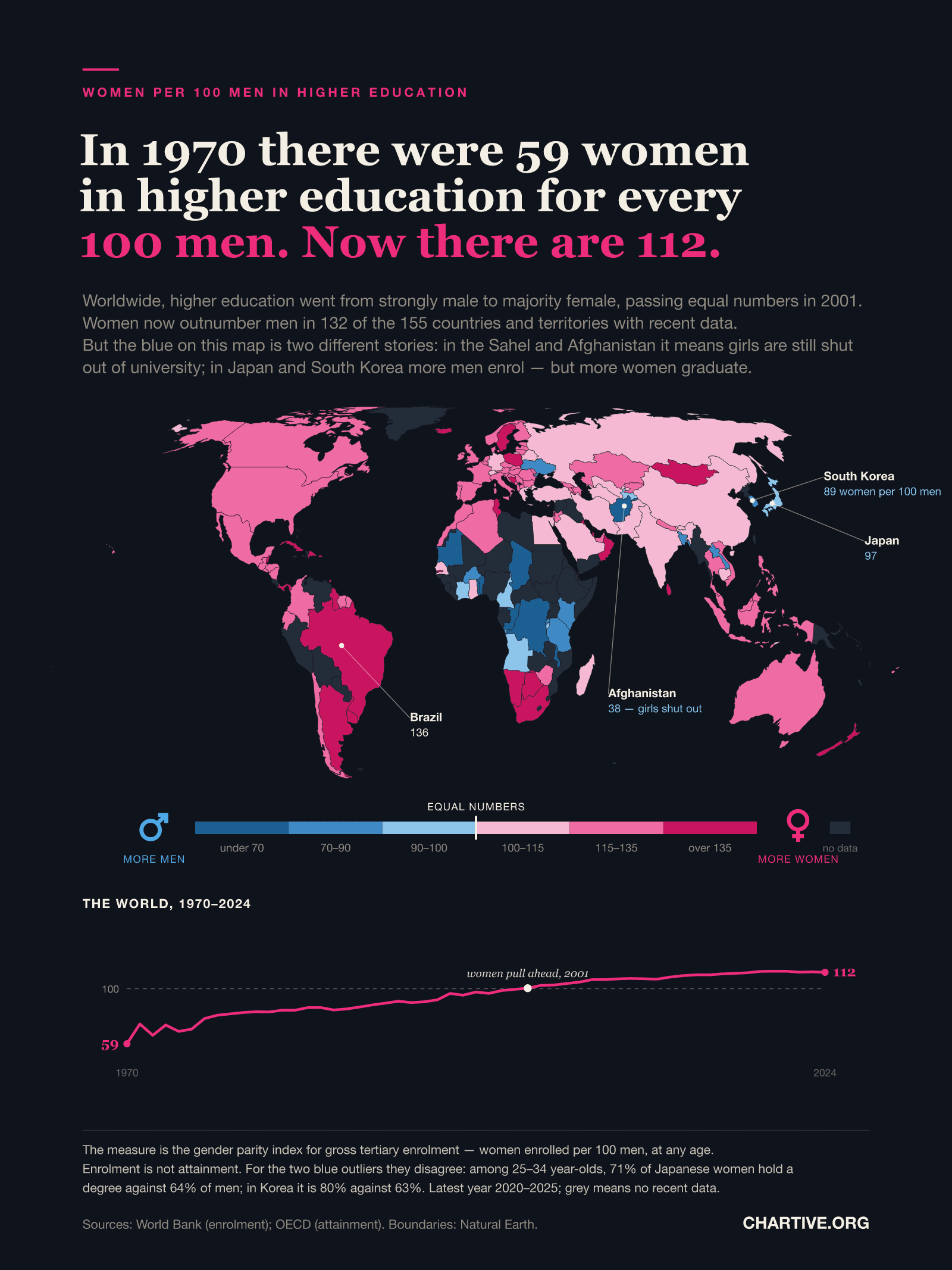
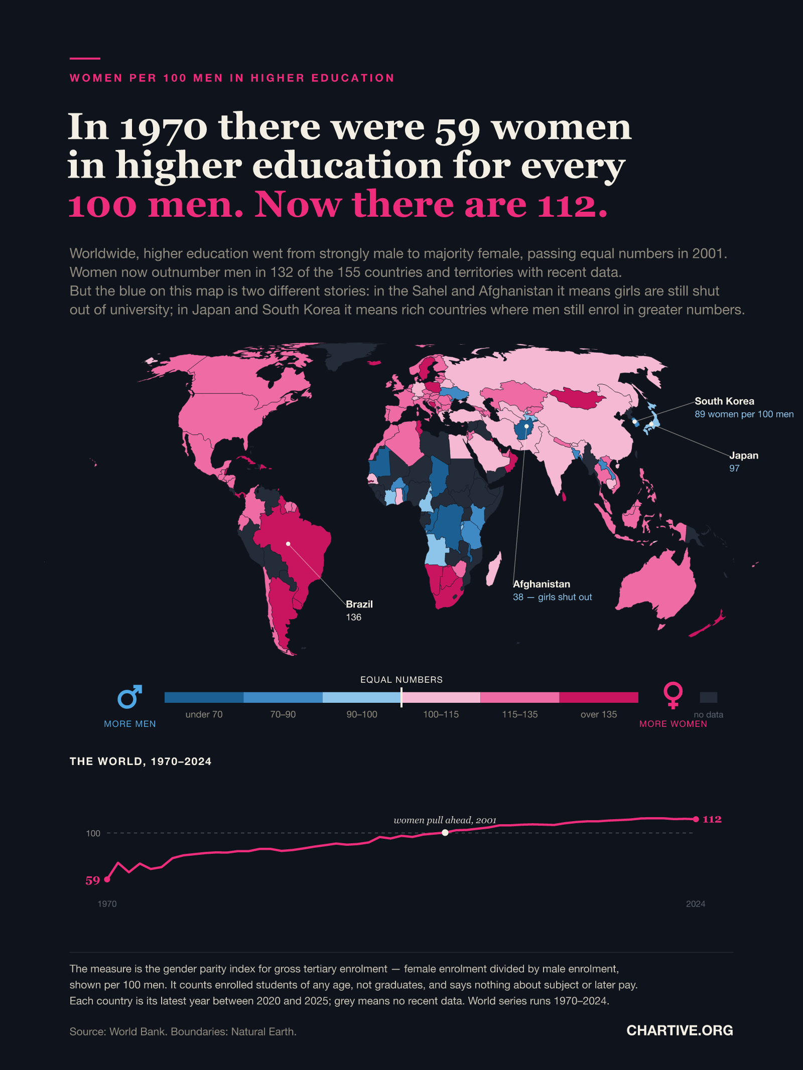
Verified dataIn 1970 there were 59 women in higher education for every 100 men. Now there are 112.
Worldwide, higher education went from strongly male to majority female, passing equal numbers in 2001. Women now outnumber men in 132 of the 155 countries and territories with recent data — but the exceptions are two very different stories.
CSV · 210 rows · 1970–2025
The ratio of women to men enrolled in higher education worldwide rose from 59 per 100 in 1970 to 112 per 100 in 2024, crossing parity in 2001. Women now outnumber men in 132 of the 155 countries and territories with data since 2020. Where men still outnumber women, the map conflates two opposite situations: in Afghanistan (38 women per 100 men), Chad (39) and much of the Sahel it means girls are still largely excluded from university, while Japan (97) and South Korea (89) are rich countries where more men are enrolled — though among 25–34 year-olds more women there hold a degree than men, so for those two the enrolment measure reverses the picture rather than describing it.
Key findings
- Worldwide there were 59 women in higher education for every 100 men in 1970; by 2024 there were 112.
- The crossing point was 2001: 99.5 women per 100 men in 2000, 100.3 in 2001.
- Women outnumber men in 132 of the 155 countries and territories with data since 2020.
- Brazil has the widest gap among large economies at 136 women per 100 men, ahead of the United States at 132.
- Japan (97) and South Korea (89) are the only high-income countries on the map where more men than women are enrolled.
- But there enrolment and attainment disagree: among 25–34 year-olds, 71% of Japanese women hold a tertiary qualification against 64% of men, and in Korea 80% against 63%.
- The lowest ratios are Afghanistan at 38 and Chad at 39, where girls are still largely shut out of university.
- So the blue on the map is not one phenomenon — it is exclusion of women in poor countries, and a measurement quirk in rich ones.
Explore the data
Coverage: Jan 1, 1970 – Dec 31, 2025 · World
Free to download and reuse. Get the data behind every new chart →
Sources
Primary source
World Development Indicators
World Bank
School enrollment, tertiary (gross), gender parity index (GPI) — SE.ENR.TERT.FM.ZS
Accessed Aug 30, 2026
Ratio of women to men enrolled at tertiary level in public and private institutions, retrieved via the World Bank API. Country values are the latest observation between 2020 and 2025; the world series runs 1970–2024.
Primary source
OECD education attainment (Education at a Glance)
OECD
Tertiary attainment of 25–34 year-olds, by sex
Accessed Aug 30, 2026
Share of 25–34 year-olds holding an ISCED 5–8 qualification, by sex, retrieved via the OECD SDMX API (DSD_EAG_LSO_EA). Used to show that for Japan and South Korea the enrolment ratio reverses the attainment picture.
Natural Earth
Natural Earth
Admin 0 – Countries, 1:110m
Accessed Aug 30, 2026
Public-domain country boundaries used for the map, drawn on the Equal Earth projection.
Methodology
The measure is the World Bank's gender parity index for gross enrolment in tertiary education (SE.ENR.TERT.FM.ZS), defined as the ratio of women to men enrolled at tertiary level in public and private institutions, shown here per 100 men. Each country is shaded by its most recent value between 2020 and 2025; countries with no observation in that window are left grey. The line beneath the map is the world aggregate for every year from 1970 to 2024. The map uses the Equal Earth projection, which preserves relative area, so no region is visually exaggerated; the projection was verified against reference coordinates. Country boundaries are Natural Earth 1:110m, joined to the data by ISO 3166-1 alpha-3 code with a fallback for the handful of polygons Natural Earth leaves uncoded, including Norway and France. Every grey polygon was checked against the full API response to confirm it reflects missing data rather than a failed join.
What this does not show
Enrolment is not attainment: the index counts students registered at tertiary level in a given year, of any age, and says nothing about who completes a degree, what they study, or what they earn afterwards. Because it is a gross ratio it is also sensitive to differences in the size of the male and female populations of student age. The 155 figures include nine territories rather than sovereign states, which is why the count is described as countries and territories; restricted to sovereign countries the figure is 123 of 146. Most importantly, a value below 100 does not have a single meaning. In low-income countries it usually reflects girls being excluded from education altogether. In Japan and South Korea it is misleading in a different way: OECD figures for 25–34 year-olds show 71% of Japanese women holding a tertiary qualification against 64% of men, and 80% against 63% in Korea. More men are enrolled in both countries, but more women end up with a degree — enrolment is stretched over more calendar years for men, and in Korea military service is one reason.
Creator
Reuse this visualization
Cite this
License: CC BY 4.0
Embed code
<figure style="margin:0;max-width:1600px">
  <a href="https://chartive.org/visualizations/education-gender-gap-map" target="_blank" rel="noopener">
    <img src="https://chartive.org/infographics/education-gender-gap-map.png" alt="World map on an Equal Earth projection showing women per 100 men enrolled in higher education. Most of the world is shaded pink, meaning women outnumber men: Brazil at 136, the United States 132, Germany 110, India 107. Blue areas where men outnumber women are concentrated in the Sahel and Afghanistan, at 38 women per 100 men, and include Japan at 97 and South Korea at 89. Grey marks countries with no recent data. A pink line beneath the map traces the world figure rising from 59 in 1970 to 112 in 2024, crossing a dashed parity line in 2001." width="1600" height="2133" style="max-width:100%;height:auto" />
  </a>
  <figcaption style="font:14px/1.4 system-ui,sans-serif;color:#57534e;margin-top:8px">
    Graphic by Chartive Editorial, using data from World Development Indicators — via <a href="https://chartive.org/visualizations/education-gender-gap-map" target="_blank" rel="noopener">Chartive</a>
  </figcaption>
</figure>
Reuse is welcome — the embed keeps a link back to the source.