Climate
Verified data175 years of a warming world
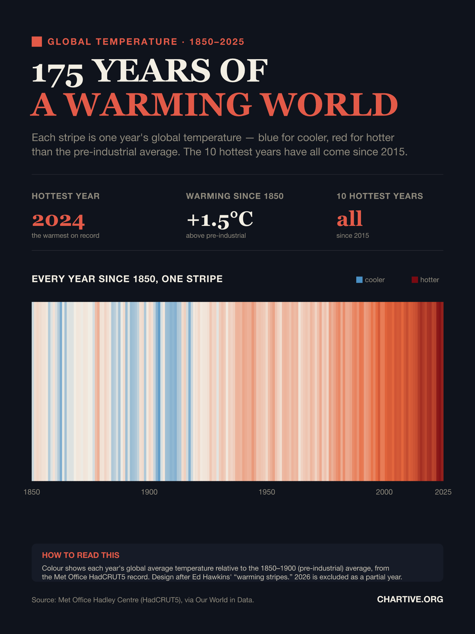
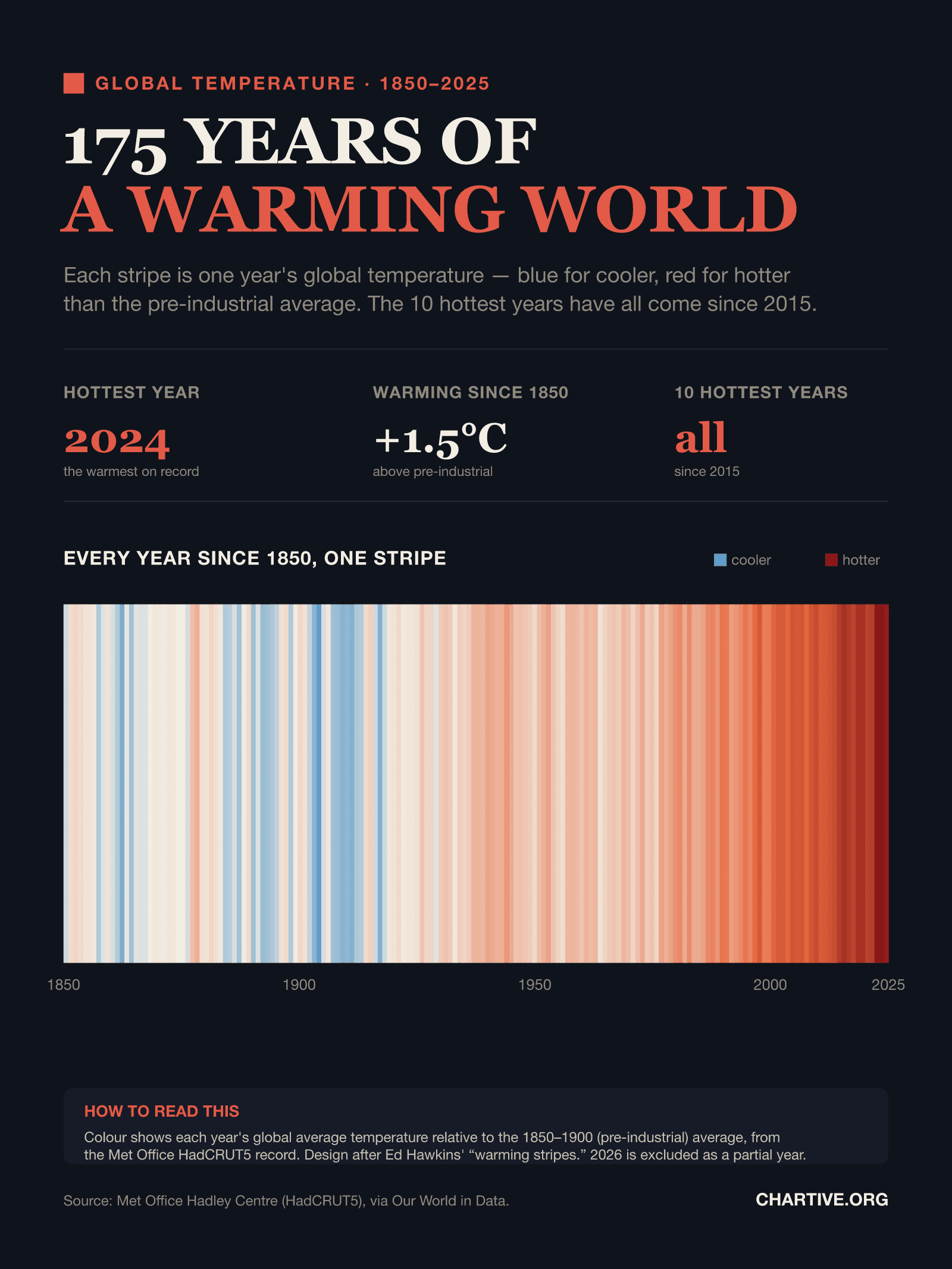
Each stripe is one year's global temperature from 1850 to 2025 — blue for cooler, red for hotter than the pre-industrial average. The ten hottest years on record have all come since 2015.
CSV · 176 rows · 1850–2025
Global temperatures have risen about 1.5°C above the 1850–1900 pre-industrial average, with 2024 the hottest year on record. Every one of the ten warmest years has occurred since 2015.
Key findings
- The world has warmed about 1.5°C since the 1850–1900 pre-industrial average.
- 2024 was the hottest year on record; the ten warmest years have all come since 2015.
- The stripes shift from mostly blue before the 1980s to deep red today.
Explore the data
Coverage: Jan 1, 1850 – Dec 31, 2025 · Global
Free to download and reuse. Get the data behind every new chart →
Sources
Primary source
Met Office Hadley Centre (HadCRUT5)
via Our World in Data
Global near-surface temperature anomaly
Accessed Aug 22, 2026
Annual global mean anomaly vs the 1850–1900 average; 'warming stripes' design after Ed Hawkins.
Methodology
Global mean near-surface temperature anomaly each year relative to the 1850–1900 (pre-industrial) average, from the Met Office Hadley Centre HadCRUT5 dataset, distributed via Our World in Data. Shown as “warming stripes” — one coloured stripe per year (design after Ed Hawkins) — so colour alone carries the trend.
What this does not show
Colour shows each year's global average temperature relative to the 1850–1900 average, not absolute temperature. Annual global means smooth over large regional and seasonal swings. 2026 is excluded as an incomplete year. The “warming stripes” concept is by climate scientist Ed Hawkins.
Creator
Reuse this visualization
Cite this
License: CC BY 4.0
Embed code
<figure style="margin:0;max-width:1600px">
  <a href="https://chartive.org/visualizations/the-world-keeps-getting-hotter" target="_blank" rel="noopener">
    <img src="https://chartive.org/infographics/the-world-keeps-getting-hotter.png" alt="Warming stripes: 176 vertical stripes, one per year from 1850 to 2025, coloured from blue (cooler) to deep red (hotter) than the pre-industrial average. Recent decades are deep red; 2024 is the hottest year on record at about 1.5°C above pre-industrial." width="1600" height="2133" style="max-width:100%;height:auto" />
  </a>
  <figcaption style="font:14px/1.4 system-ui,sans-serif;color:#57534e;margin-top:8px">
    Graphic by Chartive Editorial, using data from Met Office Hadley Centre (HadCRUT5) — via <a href="https://chartive.org/visualizations/the-world-keeps-getting-hotter" target="_blank" rel="noopener">Chartive</a>
  </figcaption>
</figure>
Reuse is welcome — the embed keeps a link back to the source.