Economy
Verified dataOne in six private-sector workers was in a union. Now it is one in seventeen.
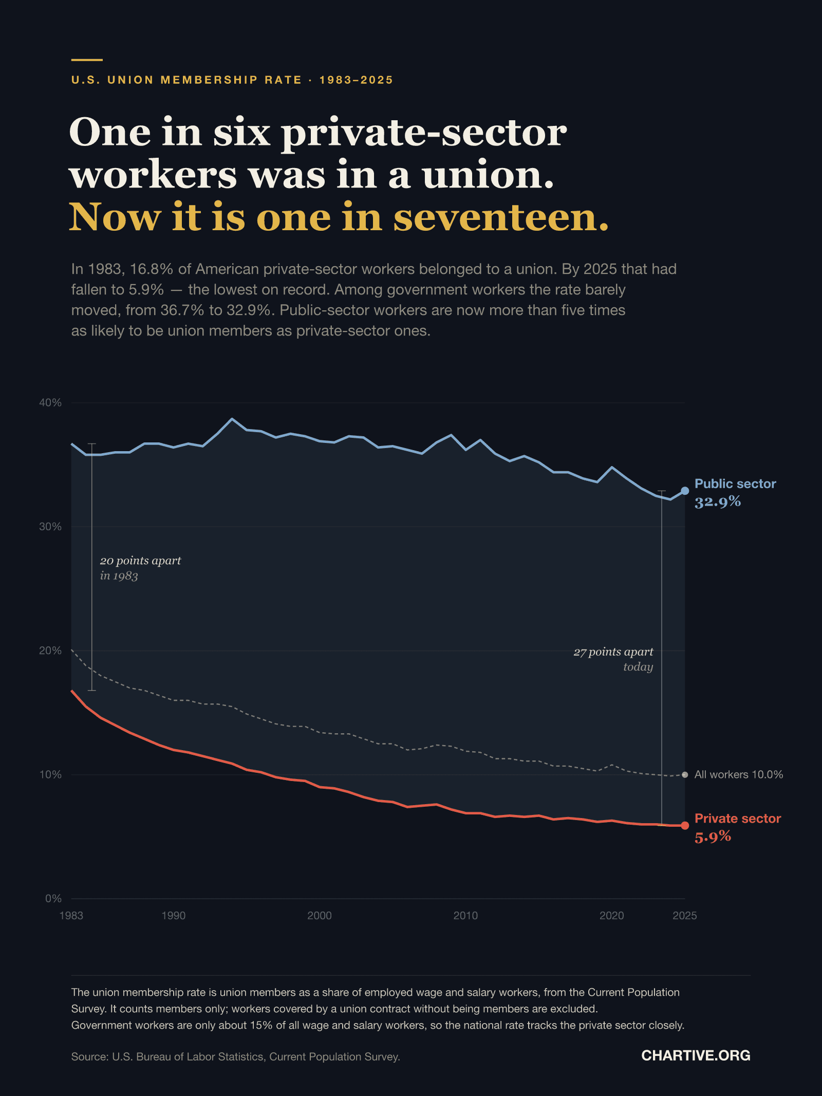
In 1983, 16.8% of American private-sector workers belonged to a union. By 2025 that had fallen to 5.9% — the lowest on record — while the rate among government workers barely moved.
CSV · 43 rows · 1983–2025
Union membership in the American private sector has collapsed, from 16.8% of workers in 1983 to 5.9% in 2025, the lowest in the four decades the series covers. Among government workers the rate fell only from 36.7% to 32.9%. The gap between the two sectors has widened from 20 percentage points to 27, and a public-sector worker is now more than five times as likely to be a union member as a private-sector one. Because government workers are only about 15% of all wage and salary employees, the national rate — down from 20.1% to 10.0% — is largely a story about the private sector.
Key findings
- Private-sector union membership fell from 16.8% in 1983 to 5.9% in 2025 — a drop of nearly two thirds.
- That 5.9% is the lowest rate in the 43 years the series covers.
- Among government workers the rate fell only 3.8 points, from 36.7% to 32.9%.
- The gap between the two sectors widened from 20 percentage points to 27.
- A public-sector worker is now 5.6 times as likely to be a union member as a private-sector one.
- The national rate halved, from 20.1% to 10.0%, tracking the private sector because government workers are only about 15% of employment.
Explore the data
Coverage: Jan 1, 1983 – Dec 31, 2025 · United States
Free to download and reuse. Get the data behind every new chart →
Sources
Primary source
Union Members (Current Population Survey)
U.S. Bureau of Labor Statistics
Union affiliation of employed wage and salary workers
Accessed Aug 30, 2026
Series LUU0204899600, LUU0204906600 and LUU0204922700, retrieved from the BLS Public Data API v2. Series titles verified against the official BLS series definition file (lu.series).
Methodology
The union membership rate is union members as a share of employed wage and salary workers, from the Current Population Survey. Figures are the U.S. Bureau of Labor Statistics series LUU0204899600 (all workers), LUU0204906600 (private wage and salary workers) and LUU0204922700 (government wage and salary workers), retrieved from the BLS Public Data API; each series identity was confirmed against the official BLS series definition file. As an internal check, the three rates were used to solve for the implied government share of employment, which stays between 14.9% and 17.1% across all 43 years — consistent with published CPS employment shares, and confirming the three series belong to the same universe.
What this does not show
The rate counts union members only. Workers covered by a union contract without joining are excluded, and that measure is roughly one percentage point higher. These are survey estimates from the Current Population Survey and carry sampling error, so single-year movements should not be over-read. Membership rates say nothing directly about union influence, bargaining outcomes or public support for unions, all of which have moved differently. The series begins in 1983 because that is when the CPS started collecting union data on a consistent basis; private-sector membership was substantially higher in earlier decades, but not on a comparable measure.
Creator
Reuse this visualization
Cite this
License: CC BY 4.0
Embed code
<figure style="margin:0;max-width:1600px">
  <a href="https://chartive.org/visualizations/us-union-membership-1983-2025" target="_blank" rel="noopener">
    <img src="https://chartive.org/infographics/us-union-membership-1983-2025.png" alt="Line chart of the U.S. union membership rate from 1983 to 2025 on a 0 to 40 percent scale. The private-sector line falls steadily from 16.8% to 5.9%. The public-sector line stays high, drifting only from 36.7% to 32.9%. The shaded gap between them widens from 20 percentage points in 1983 to 27 today. A dashed line for all workers falls from 20.1% to 10.0%." width="1600" height="2133" style="max-width:100%;height:auto" />
  </a>
  <figcaption style="font:14px/1.4 system-ui,sans-serif;color:#57534e;margin-top:8px">
    Graphic by Chartive Editorial, using data from Union Members (Current Population Survey) — via <a href="https://chartive.org/visualizations/us-union-membership-1983-2025" target="_blank" rel="noopener">Chartive</a>
  </figcaption>
</figure>
Reuse is welcome — the embed keeps a link back to the source.