Society
Verified dataWhat kills us vs. what makes the news
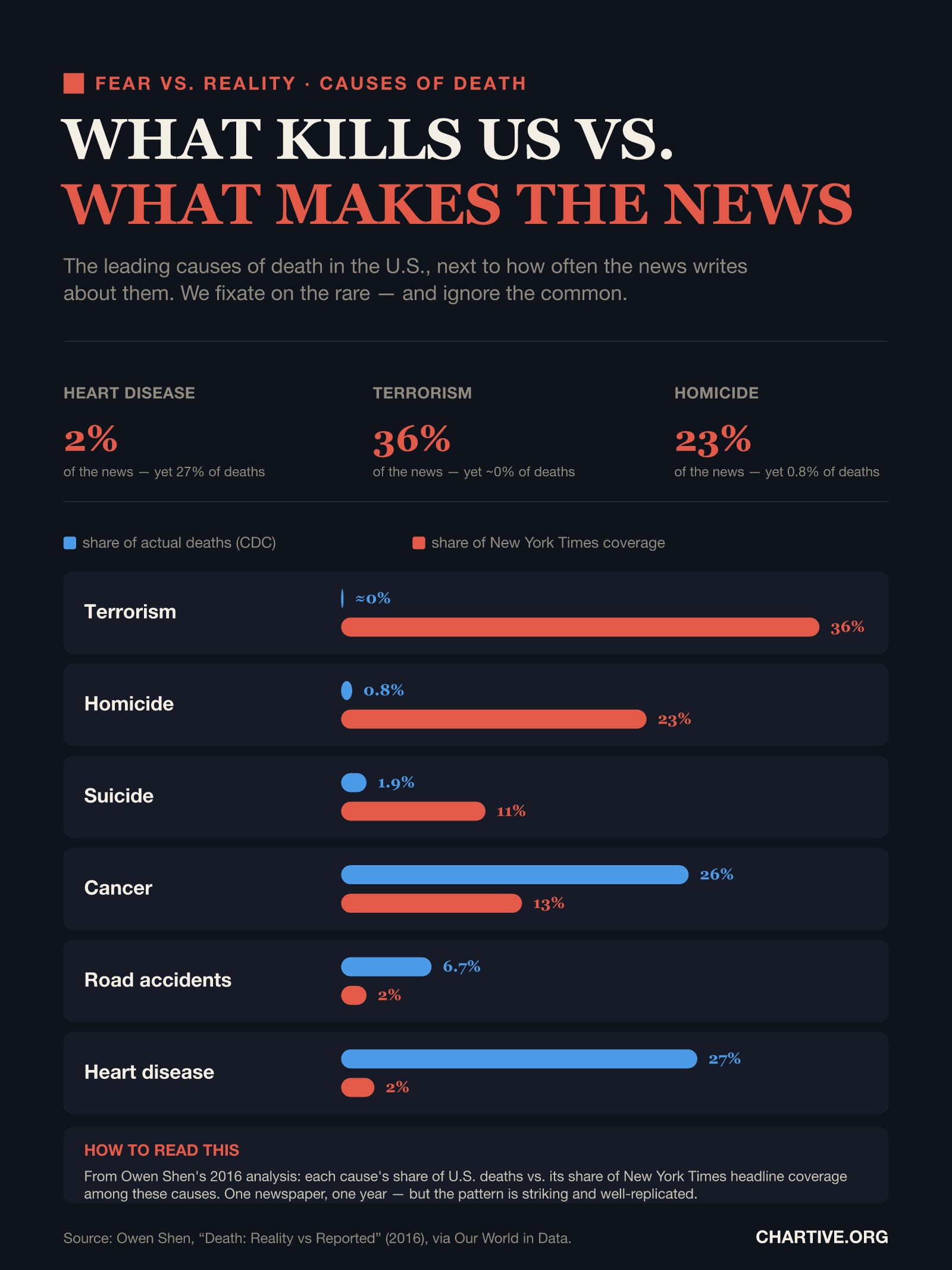
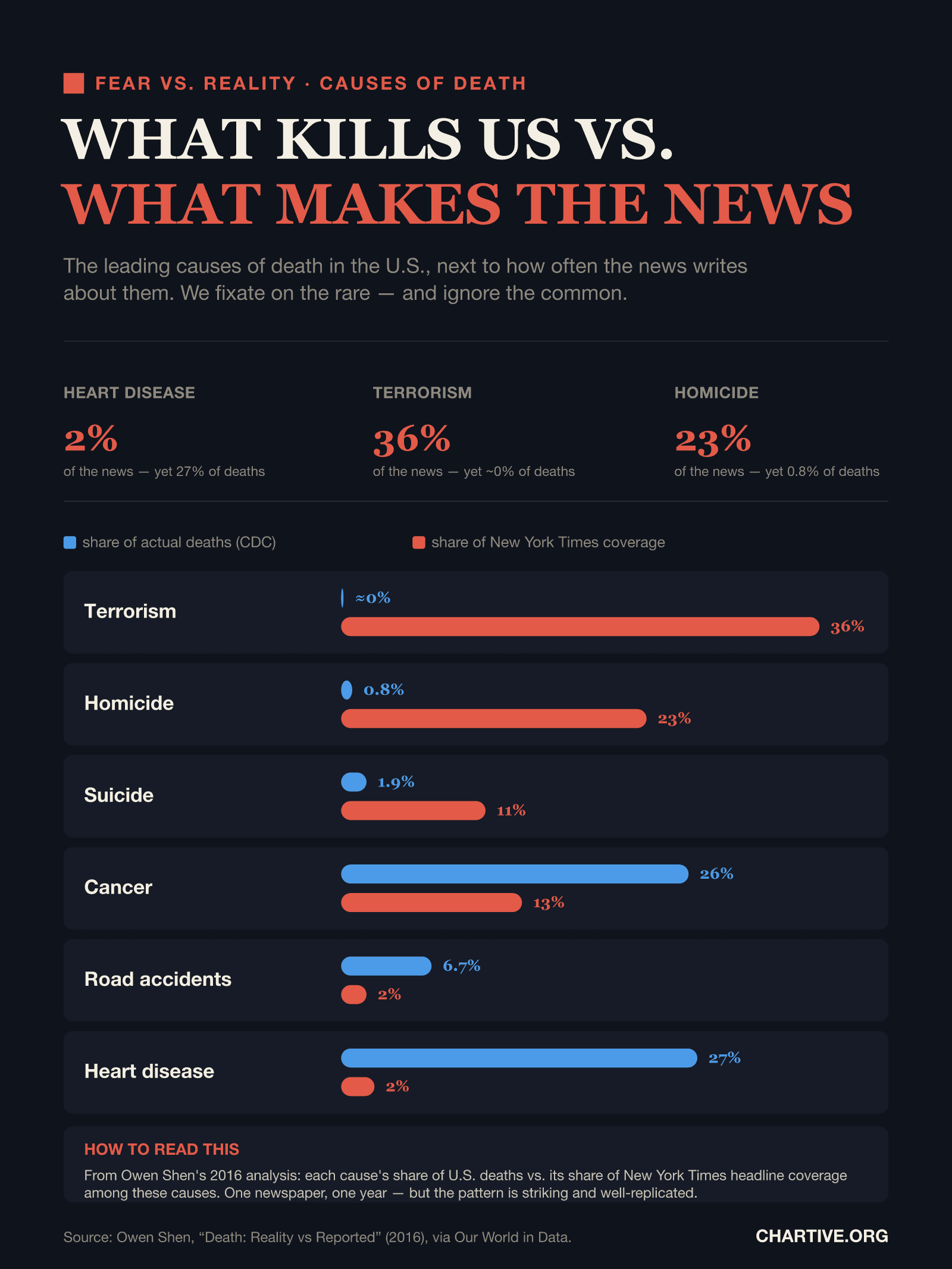
The leading causes of death in the U.S., next to how often the news writes about them. We fixate on the rare — and ignore the common.
CSV · 13 rows · 2016
Terrorism and homicide together caused under 1% of U.S. deaths in 2016 but filled well over half of New York Times coverage of these causes. Heart disease, which kills more than one in four Americans, made up just 2% of that coverage — we fear the rare and overlook the common.
Key findings
- Terrorism caused about 0% of U.S. deaths in 2016 but made up roughly 36% of New York Times coverage of these causes.
- Heart disease killed more than one in four Americans, yet accounted for just 2% of that coverage.
- Homicide and suicide are heavily over-covered; cancer, road accidents and heart disease are under-covered.
Explore the data
Coverage: Jan 1, 2016 – Dec 31, 2016 · United States
Free to download and reuse. Get the data behind every new chart →
Sources
Primary source
Owen Shen, “Death: Reality vs Reported”
via Our World in Data
Causes of death vs. media coverage
Accessed Aug 22, 2026
CDC share of deaths vs. New York Times headline coverage, 2016.
Methodology
From Owen Shen's “Death: Reality vs Reported” analysis, distributed via Our World in Data. For 2016, each cause's share of U.S. deaths (CDC) is compared with its share of headline coverage in The New York Times among 13 selected causes — the top ten causes of death plus terrorism, homicide and drug overdose. Google Trends and Guardian coverage are also included in the dataset.
What this does not show
This is a 2016 snapshot of one newspaper (The New York Times); the exact figures reflect Shen's methodology and the causes selected, and “coverage” is a share among these causes, not of all news. The overall pattern — rare, violent causes over-covered and common diseases under-covered — is well replicated across outlets and years.
Creator
Reuse this visualization
Cite this
License: CC BY 4.0
Embed code
<figure style="margin:0;max-width:1600px">
  <a href="https://chartive.org/visualizations/what-kills-us-vs-the-news" target="_blank" rel="noopener">
    <img src="https://chartive.org/infographics/what-kills-us-vs-the-news.png" alt="Paired bar chart comparing each cause's share of U.S. deaths with its share of New York Times coverage in 2016. Terrorism: ~0% of deaths but 36% of coverage; homicide 0.8% vs 23%; suicide 1.9% vs 11%; cancer 26% vs 13%; road accidents 6.7% vs 2%; heart disease 27% vs 2%." width="1600" height="2133" style="max-width:100%;height:auto" />
  </a>
  <figcaption style="font:14px/1.4 system-ui,sans-serif;color:#57534e;margin-top:8px">
    Graphic by Chartive Editorial, using data from Owen Shen, “Death: Reality vs Reported” — via <a href="https://chartive.org/visualizations/what-kills-us-vs-the-news" target="_blank" rel="noopener">Chartive</a>
  </figcaption>
</figure>
Reuse is welcome — the embed keeps a link back to the source.